What's worse than a slow loading website? A website that doesn't load at all. And to make matters even worse, let's make that accompanied by an ugly error page. In the past, we've built our error pages to be as simple as possible with minimum text and design. The idea was to have a clean and simple layout that would not take attention away from your brand.
But seeing just a big blue screen with an error message can be annoying, frustrating and simply looks bad. We thought we can do better. Nobody likes to see an error page, so we thought at least what we can do is make that a better experience for the user, even if your server simply experienced a hiccup for a few seconds.
Introducing Error Pages 2.0
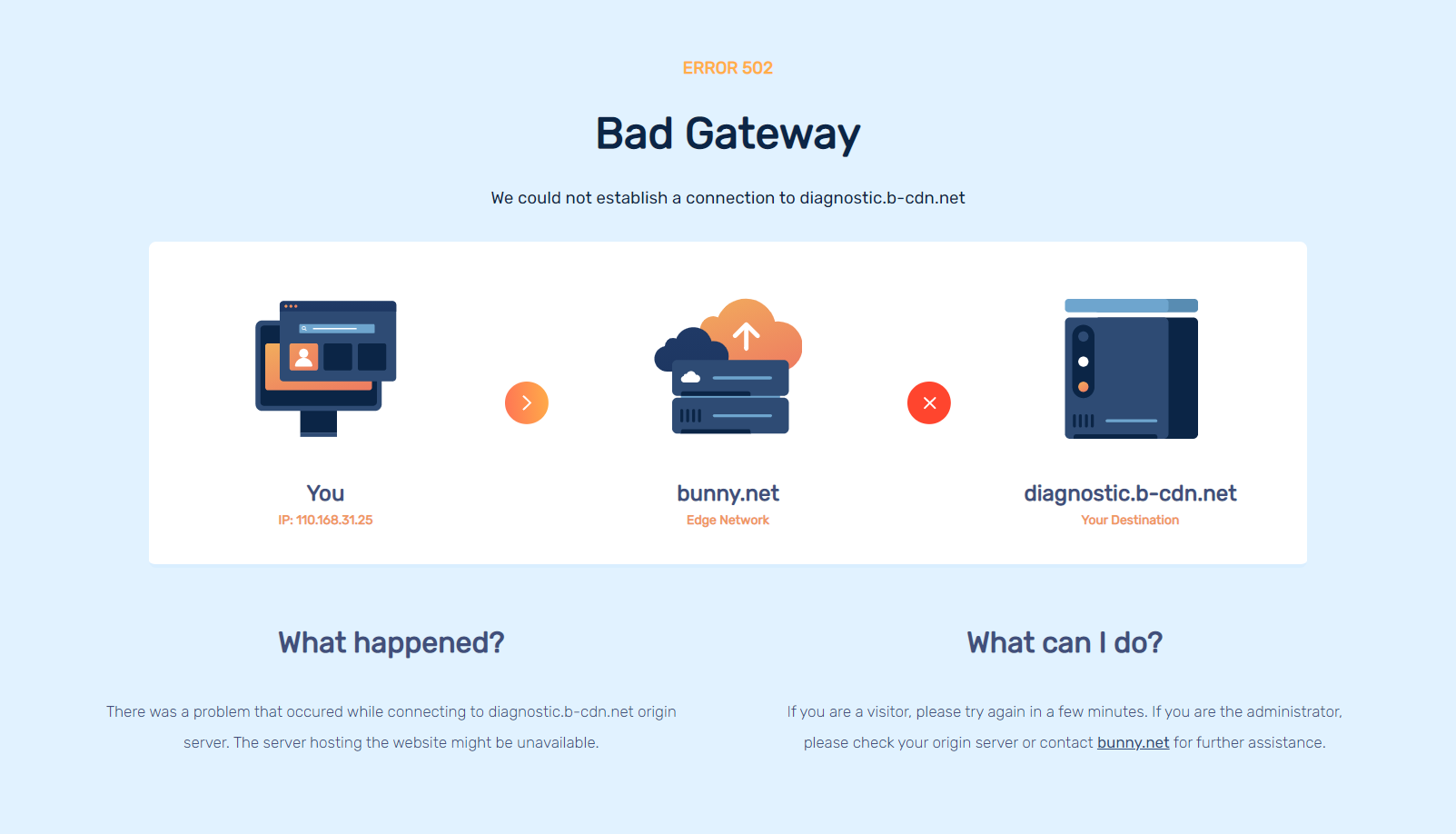
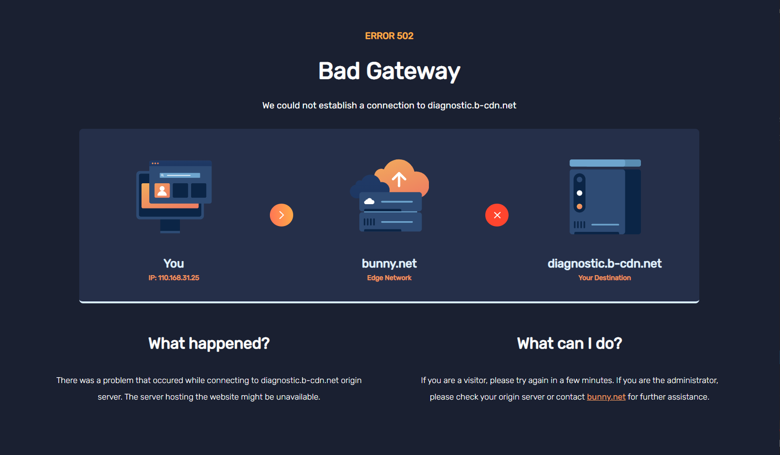
That being said, we are happy to introduce our new error page designs and an exciting new take on what an error page can be! Gone is the plain old blue screen, replaced by a cleaner, modern and more informative page.
StatusPage Integration
Outages suck and if your servers are experiencing a problem, your visitors can be left confused and wondering what is going on. We've all been there. It's a frustrating experience both for the website administrators, but especially the end user.
We thought, how can we make this better? Throughout our experience, we found one missing link. Updating the users about what was actually going on. While an error page, even with a full technical explanation tells the user what happened, it does not do a very good job of actually explaining why, and what the current situation is.
To help with that, we thought there was a very neat solution. Implement a realtime StatusPage widget integration to let you update and inform your users straight from the error page itself. Instead of users calling and emailing, this allows visitors to be immediately informed and follow any ongoing incidents and greatly reduce the stress both on your team as well as the visitors on your website.
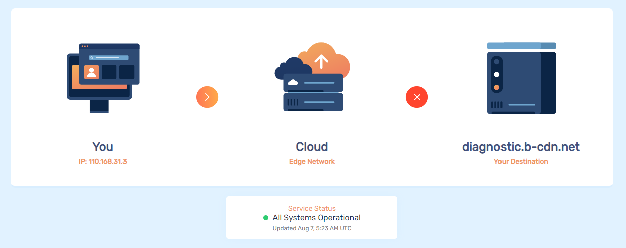
It's a small, but nevertheless exciting new addition. We hope we can help you reduce frustrations and make the internet a bit more enjoyable.
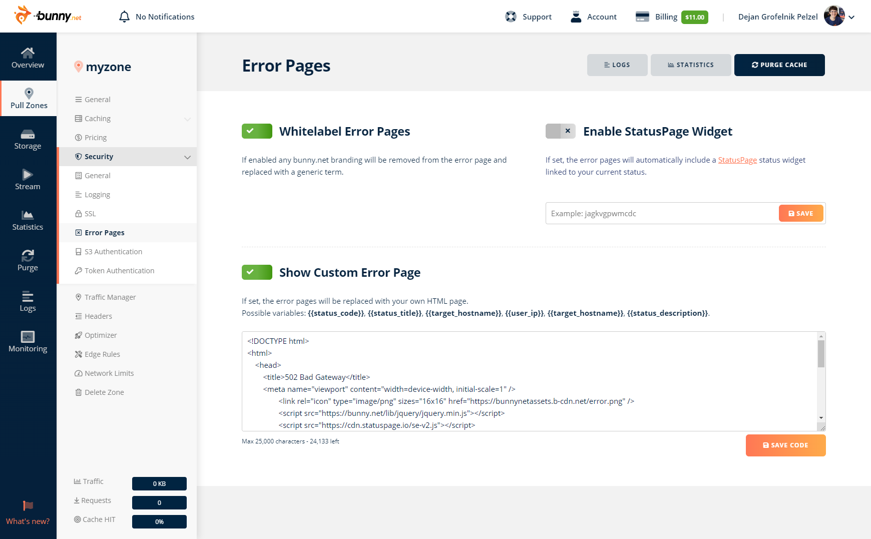
Best of all, it can be configured as simple as entering your StatusPage code in the dashboard.
Dark Mode
Dark themes are all the buzz these days. In fact, so much so that our team could not decide on the actual color theme of the error pages. After a lot of going back and forth, we eventually realized there's a much neater solution. We're happy to say the new designs now automatically adapt to the end-user's browser settings and displays whichever theme suits them best.
Custom Error Pages
Not a fan of the design or messaging? We completely understand you. Branding and design choices can be an important factor and we don't want to limit anyone into our own. That being said, we're happy to introduce the new Custom Error Page feature that allows you to create your own design to fit with your brand.
We also expose a couple of different placeholders that allow you to display existing error codes and messages.
Making The Internet Experience Better
It's a small update, but one we're very happy about nevertheless. While the error pages will hopefully be shown as little as possible, it's our goal to make this the least stressful experience possible, be it for you or your customers.
The error pages are just a tiny part of a much bigger update that made this possible, and we're excited to introduce the additional features that we've been working on in the coming weeks.


